Why this page?
Actually, this is the 3rd version of my personal page. The first 2.5 versions were built with pure HTML/CSS/JS. (You will know why there is a .5 version in later part)
Version 1
The 1st version design is rather simple, but I tried to implement all the features a webpage would need in modern era.
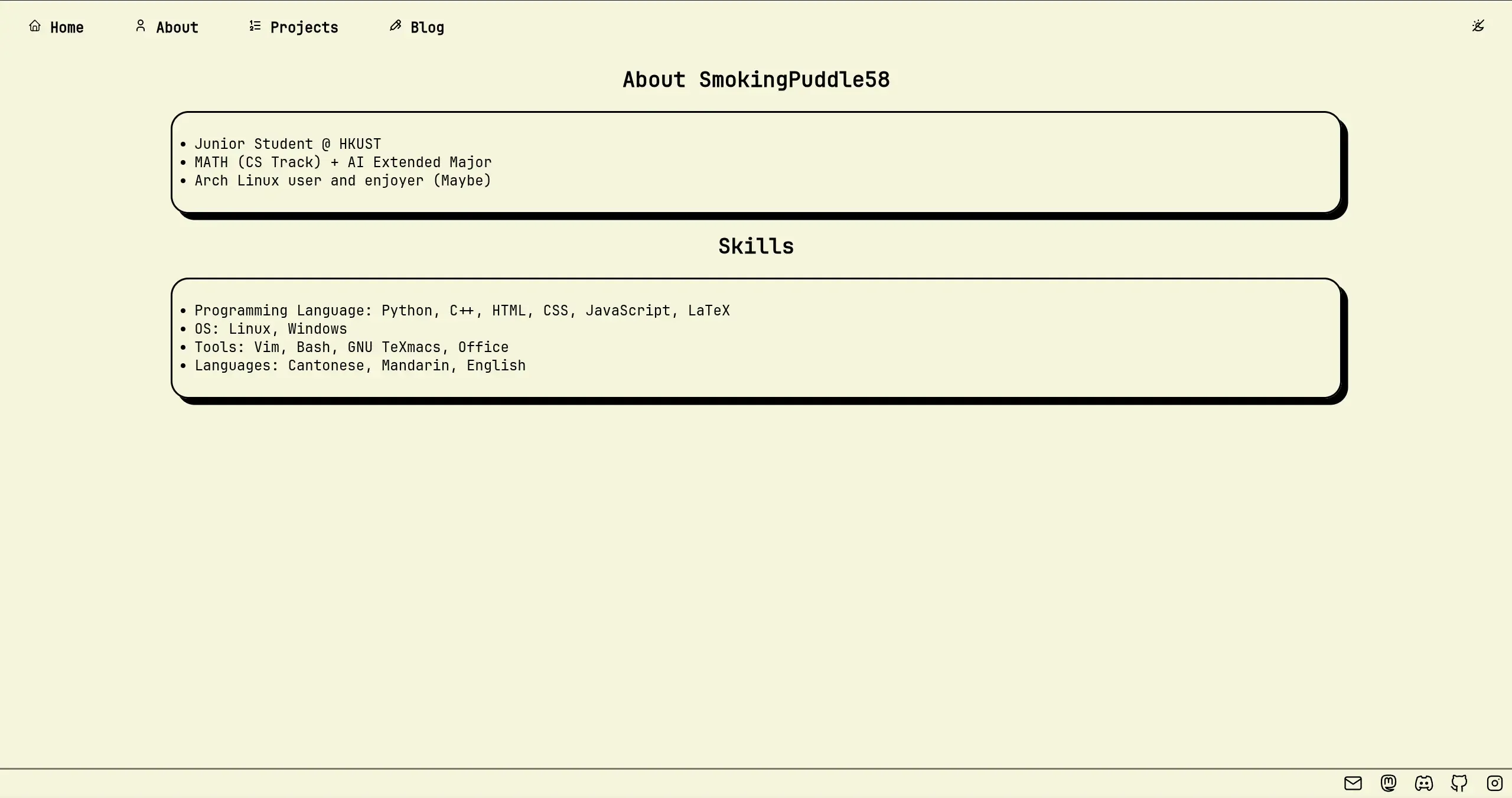
Very sadly, during an interview for frontend developer at a startup in year 3, they were curious at my page. After they saw the page, they said: “You page looks too plain” (In original language: 你嗰網頁睇落有啲簡單喎). After that I got rejected (Actually not rejected but just like usual process: Getting no replies from the company.)
Version 2
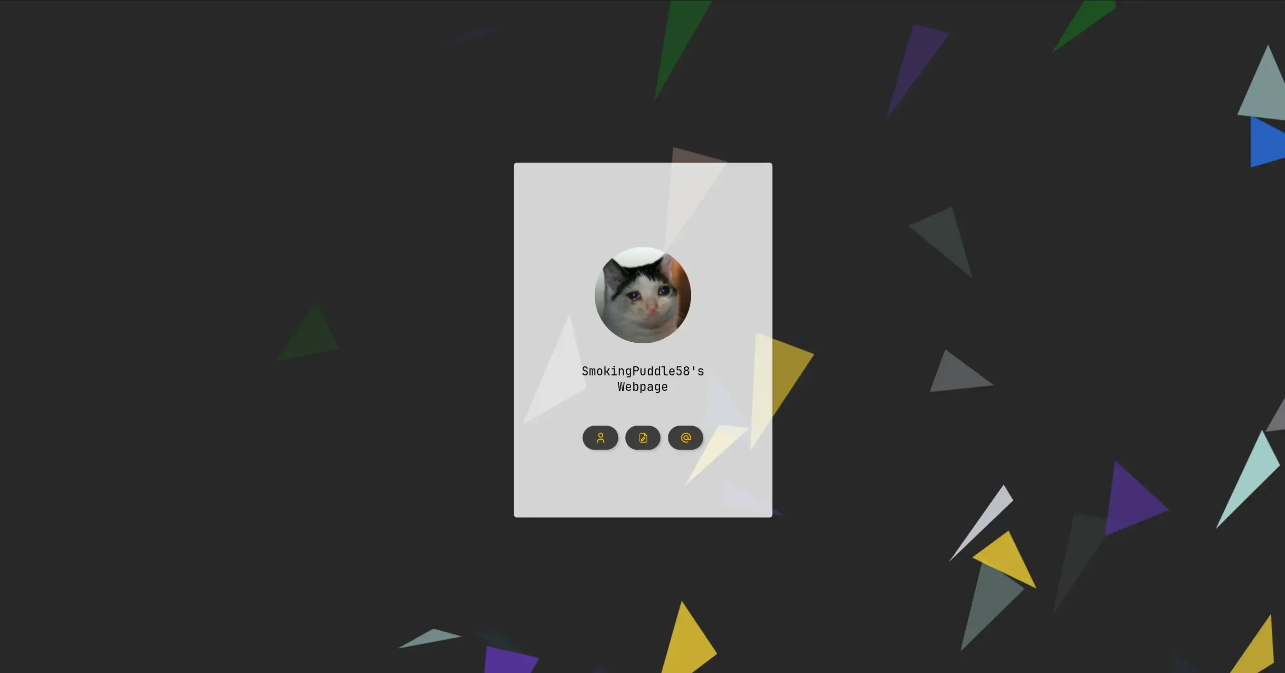
This is why second version was created. I have tried to make the page to look fancier than the original page, still, by using plain HTML/CSS/JS. The design was inspired by one of the page I saw before, but I cannot find the source now. Anyway it was a card-like design which aimed to be slightly fancier required by the employers but still keeping as simple as much to my standard. Also, I tried to add CSS Doodles as background to make the page less boring (Actually because I don’t know what colour to use as a background) The second version was also not good enough, especially on mobile phone. Some fixing was done back and forth to improve experiences.
Version 2.5
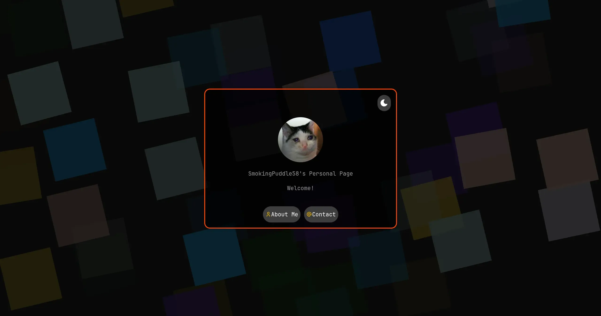
Then we have the 2.5 version of this page. Actually this page was almost a remade version of version 2 since I have changed the code a lot. Why it is called .5 version is simply because the design and the contents were almost the same as version 2, but improved the experience on mobile phone a lot (Really, a lot), and some other minor improvements like buttons.
Version 3
The first 2 versions had a very great disadvantage that could greatly affect user experience: The page has to be fully loaded before it can be viewed. It is simply because I write everything in one HTML page.
Wait! Aren’t you using multiple webpages? No, actually not. By using one simple page, I can prevent flashing from white to dark mode when user changes pages. Then I just choose to hide the parts by using CSS.
Also, the second advantage is that, I have to create another system for writing blogs (Hugo for your interest). The management is not easy and the styles does not match with my main webpage. Taking this opportunity, I have planned to rewrite this page fully with a framework to make the page as simple as possible; as modern as possible and as easy to maintain as possible. Astro is actually a good choice for this since it is specially made for content-focused webpages.
Unfortunately, I was somehow busy to do this during my final year since I took a lot of difficult courses that makes me mentally unhealthy (Just like other HKUST students). After graduation, I finally planned to do this thing. I even put that on my CV, telling the recruiters I am learning this new framework (Just for more interview opportunities you know). The progress was however extremely slow since I was busying finding jobs and feeling desperate for the days without any jobs.
Anyway, I finally have a bunch of time to do this after I received the job offer from HKUST (Thank you so much OwO). So by using a few days, I almost completed 3rd version of this page, which is this version you are seeing now.
How the page was designed
Features
The page wasn’t designed from scratch. Rather, I decided to start with their Astro Starter Kit: Blog. The blog template was such plain and require lots of modifications, which is actually good since I have more freedom to design how the blog should look like. The blog was such plain that it lacks of some modern features that one would see on a modern blog, including table of contents, reading time estimation etc. It also needs some modifications to makes it look better and more compact (Hero Image would take up too much space).
I have implemented some important features which will be quite useful for a blog, including read time, table of contents, category & tags, pin etc. They are just part of the finished features, and I plan to add more features in the future when I have time like author card that will be displayed at the end of the page (Done) and some LaTeX support (Done).
Fonts
Just like the previous versions of my webpage, I prefer using JetBrains Mono since it is design for long time reading, and also it is one of my favourite font that I use on IDE.
Colors
Currently, I am using the default color that is used in the template and it looks fine. In the future I may also add a night mode for the sake for programmers’ eyes health.
Accessibility
I have been trying my best for this part, including using colors with high contrast ratio and adding aria-label for images and some buttons whenever I can. I think I will further improve this part when I have more time I guess.
According to Google PageSpeed Insights, the accessibility part scored 100, which I considered to be good enough I guess.
Changelog
The changelog is only for this version. For the previous versions I did not have something like this. (My git commit message are in a very bad style)
September 2025
The very first style of this page, functionalities to be added.
October 2025
A very quick review on October. In this month I further increased some functionality of this blog, including adding locks to the pages desired thanks to this page. The update seems slow coz I have been more and more busier for my work and the page is actually 80% complete. What I am planning next is to complete the search function, i18n and dark modes to protect viewers’ eyes.
To be continued … QwQ
November 2025
Also a busy month, but I managed to add a webring page. Yep, such a busy month.